Subscriber question:
"Garmin’s new SmartCharts feature looks really cool, but I use ForeFlight. Is there any way to get ForeFlight to show just the information I actually need, like SmartCharts?" —Wendy J.
Not subscribed yet? Sign up here to receive tips like this every week.
Ryan:
 “To an extent, yes. But first, some background.
Paper charts had to show all the information for every potential user. So our digital replicas offer far more information than any specific pilot actually needs.
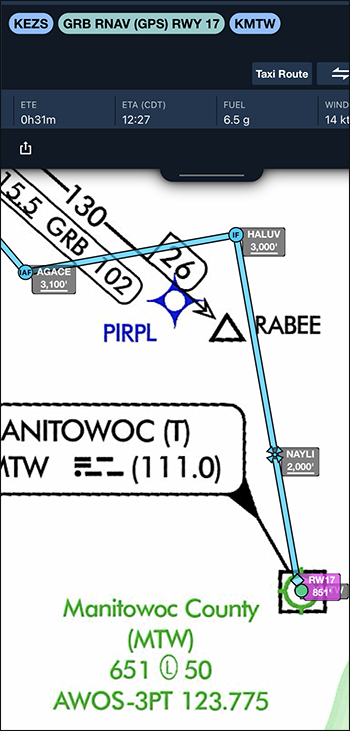
Take the RNAV Rwy 17 at Manitowoc, WI (KMTW). It has five ways to get on the approach: three IAFs and two feeder routes. You’ll only fly one of them. It has a course reversal that you may, or may not, need, four lines of minimums across four approach categories, and a handful of notes that probably don’t apply to your situation. On top of that, there are elevations, frequencies, approach light systems, glide path angles, airport sketch details, and more that you’ll brief or set up in advance, and then be done with.
With Garmin’s SmartCharts, you choose which transition and minimums you’ll use, as well as details like inoperative approach lighting or remote altimeter settings. Then it displays only what’s useful while you fly. In general, that’s the sequence of waypoints for the specific transition you’re using, along with minimum altitudes, the DA or MDA, and the missed approach procedure. Everything is geo-referenced and to scale—including the profile view. All the other information is one touch away in case you need it.
ForeFlight doesn’t have a SmartCharts equivalent, but its Procedure Advisor offers some similar benefits. You access it from the Flight Plan window at the top of the Maps tab, by touching Procedure. Choose your approach, transition, and minimums. ForeFlight then adds the sequence of waypoints and minimum altitudes to both the flight plan and the map. ForeFlight doesn’t display the missed approach procedure, however. Consider annotating it directly on the map. Or at the very least, memorize the first step.
When you load the procedure this way, ForeFlight overlays the full chart on the map. Since the goal is to declutter and simplify, I suggest removing it to leave only the critical items in view. Keep the full chart on the Plates tab where it’s just a tap away if you need it, and for briefing the procedure.
It’s likely we’ll all move away from exact digital recreations of paper charts in favor of something that’s tailored to the specific flight. Until then, use the tools you have to make things simpler, clearer, and easier in the cockpit.”
Which chart or map display is most important to you on an instrument approach?