
Our Faith in NEXRAD
In my younger days, my concept of weather data in flight was watching the clouds get darker as I trundled along the VOR radial, and wondering how rough the next 30 minutes might get. Now, I feel naked without in-cockpit weather, and will ask for deviations around denser precip just to keep from spilling my coffee.
My confidence in such requests got a reality check on a recent flight where more information made the decisions less clear. In fact, at first glance, they appeared diametrically opposed.
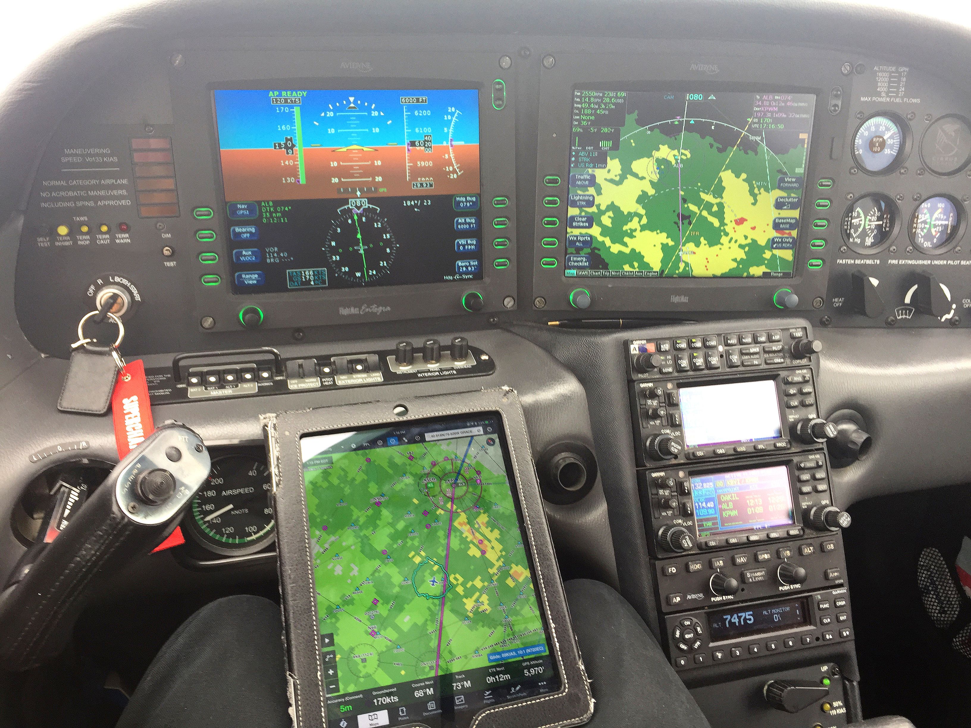
The route was direct Albany VOR (ALB), when two hours of hand-flying through IMC looked like it would end. (Yeah, that’s a photo in a Cirrus with the autopilot off. It’s not digitally altered. We all need the practice to stay sharp.) The iPad in my lap displayed ADS-B weather with stronger returns right of my course. The smoothest ride might have been to, first, head a bit left (north), before crossing over ALB as planned. However, the XM weather on the MFD displayed a 20-mile wide area of low-energy returns left of the course, implying that a course southeast of ALB offered the smoothest ride. The ideal path using the MFD as my guide would be right on the edge of what I’d purposefully avoid using the iPad.
This dilemma wasn’t life-and-death, perhaps, not even spilling-the-coffee or not. For simplicity, I just stayed on course to ALB, feeling equivalent bumps to driving down a dirt road. That’s not the point.
It’s concerning that with only one of the weather presentations, I might have asked for a deviation with complete confidence. Had the returns been stronger, that misplaced confidence would have had real consequences. Using only one of the NEXRAD images, I would have asked for different things. Surely, both displays can’t be correct. Or, can they?
Let’s eliminate some potential sources for the discrepancy. The weather was not a rapidly changing convective environment, and the timestamps on both NEXRAD images were nearly identical. Both are “composite” reflectivity but come from different weather providers. We tend to simplify our thinking of NEXRAD as “base” or “composite” as if base always shows returns from the lowest part of the sky and composite displays all returns from the ground to the stratosphere. It’s not that simple.
Base reflectivity usually means “lowest tilt” reflectivity. This angle has the best chance of showing rain that would reach the ground, but it isn’t always low — once the beam is 125 miles from the station, the lowest tilt of the radar is looking 17,000 feet in the air. That’s one of the reasons it’s essential to combine images from multiple stations into a mosaic, which is a single NEXRAD image. (For a more in-depth explanation, see “Getting the Lowdown on ForeFlight Radar” in Scott Dennstaedt’s excellent ForeFlight blog.
Composite reflectivity adds multiple scan angles into the mosaic, but not necessarily all of them. What data is included — and what is left out — is part of the “secret sauce” different weather providers use, and part of the reason why we may see such different images.
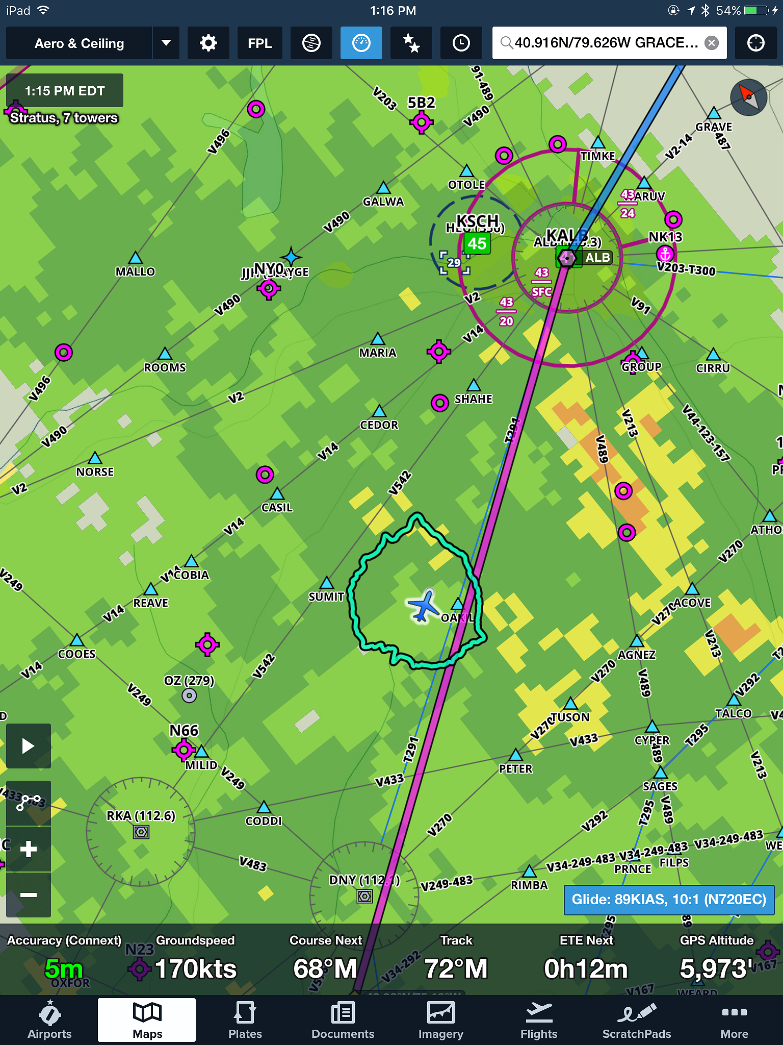
The radar images, also, might not be as different as they first appear. The orientation on the MFD was heading-up. The iPad was track-up, but I had panned around, so now it was on some odd orientation. The MFD had a current direct-to ALB after a previous deviation. The iPad still displayed an old course because it hadn’t been updated.
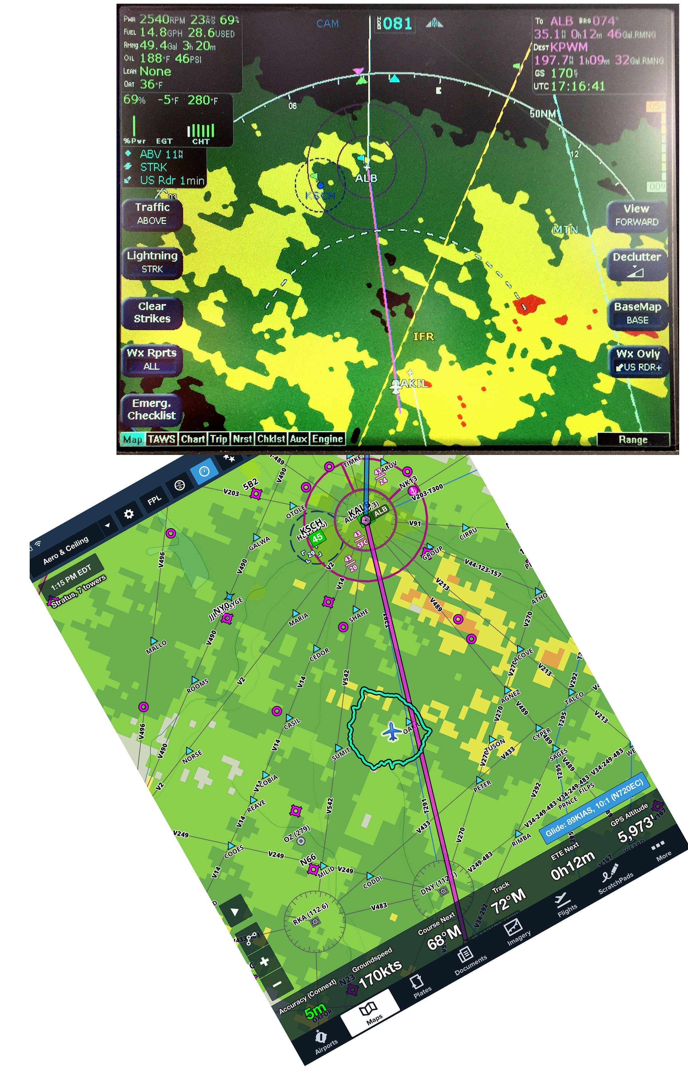
When you rotate and scale the iPad image to match the MFD (above), the two images better align. The iPad still displays heavier returns where the MFD displays fewer, but the gaps line up better, and the logic of just staying on the course to ALB looks more consistent. Note to self: Think hard about the map scale and orientation when making any weather deviation based on in-cockpit images.
The two images would agree more if the color scales were the same. On the iPad using ADS-B weather, the colors decode as: light green is 20-30 dBz, dark green is 30-40 dBz, yellow is 40-45 dBz and amber is 45-50 dBz. On the MFD, green is 20-30 dBz, yellow is 30-40 dBz, and red is 40-50 dBz. (There is a way to get everything on the same scale. See the ForeFlight Question of the Month. Also, the color scales are different for internet-based weather. Check the manual for whatever app you use to know what colors equate to in dBz for all situations.)
The danger zone is usually considered to be 40 dBz and higher, so staying clear of the yellow on the iPad is a usually good policy. But the MFD paints yellow for 30-40 dBz returns that might be fine to fly though, and that the iPad would paint dark green.
Given the differences in radar color scales, it, now, makes sense that the iPad displays a wide swath of dark green with bits of yellow to the right of the airplane, while the MFD displays a wide area of yellow with bits of red in the same locations. The largest area of red on the MFD (on that dashed, curved distance ring) is the same return as the yellow and orange shown on the iPad (furthest right of the screen, just to the right of ACOVE).
DBz isn’t the only factor worth considering. The distance between the “contour lines” reveal how much the dBz increases in intensity over a certain distance. The greater the change in intensity over a shorter distance, the greater the hazard. On this flight, the distance between contour lines is relatively wide–that’s pretty benign.
Even after all this alignment, there’s still a discrepancy. The iPad shows yellow and amber by V213 and V489 — a no-fly of over 40 dBz on ADS-B dBz scales — yet the MFD shows some yellow (30-40 dBz) surrounded by green (20-30 dBz), which I’d been flying through for nearly two hours. Remember, yellow and amber on my iPad would be red on the MFD. So, there’s an area I refuse to cross using only the iPad, but would bisect without much concern using only the MFD. That’s a little spooky.
Which display was right? Beats me. I could have asked ATC, but I didn’t. That might have shed light, or he might have called it “light to moderate precip,” leaving me as uncertain as before.
So, which is better, XM or ADS-B? Again, beats me. The takeaway is that all such information should be considered an educated opinion, not a fact. It’s data that’s been collected from various sources, processed automatically, checked by a human briefly, and then pumped out to our cockpits. It’s neither completely right nor completely wrong. And, of course, NEXRAD mosaics shouldn’t be used for sole-source choices on navigating any kind of weather, especially for close-in tactical decisions.
Having that extra info sure beats just watching the clouds get darker, though.
Watch This Video:
An Alternative to the “Five Ts”
Misleading Lightning
Stormscopes don’t seem as common as they once were, and that’s too bad because they’re a great adjunct to NEXRAD. A sferic device like a stormscope does a great job showing the relative bearing of the electrical activity, but it’s not always so hot on distance. Stronger lightning strikes appear closer to the aircraft than they really are. Weak ones appear further away than they really are — and, from the perspective of light aircraft, no lightning should be considered weak.
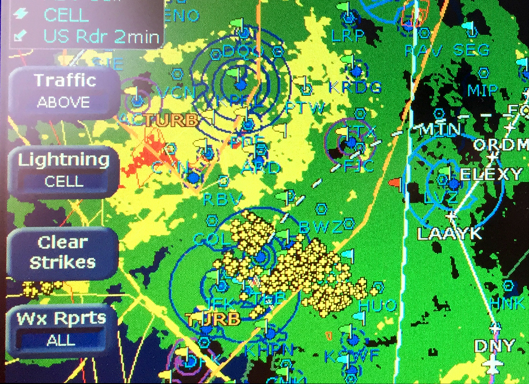
By combining the lightning and the NEXRAD, you get a better picture. The bearing to the lightning should also be the bearing to the cell that generated it. If the lighting is between you and cell, in apparently clear air, it’s likely those strikes are extra-strong, and that cell should be given extra distance. It’s also possible there’s activity in that spot but it’s growing fast and the NEXRAD isn’t painting any precip yet. Either way: Stay far away.
ForeFlight Question of the Month:
If the Four-Color Radar option had been turned on for the ADS-B NEXRAD on the iPad for this flight, the image would have appeared:
A. Far more ominous.
B. Far more benign.
C. About the same.
D. Exactly the same, because the Four-Color Radar option only applies to internet weather.